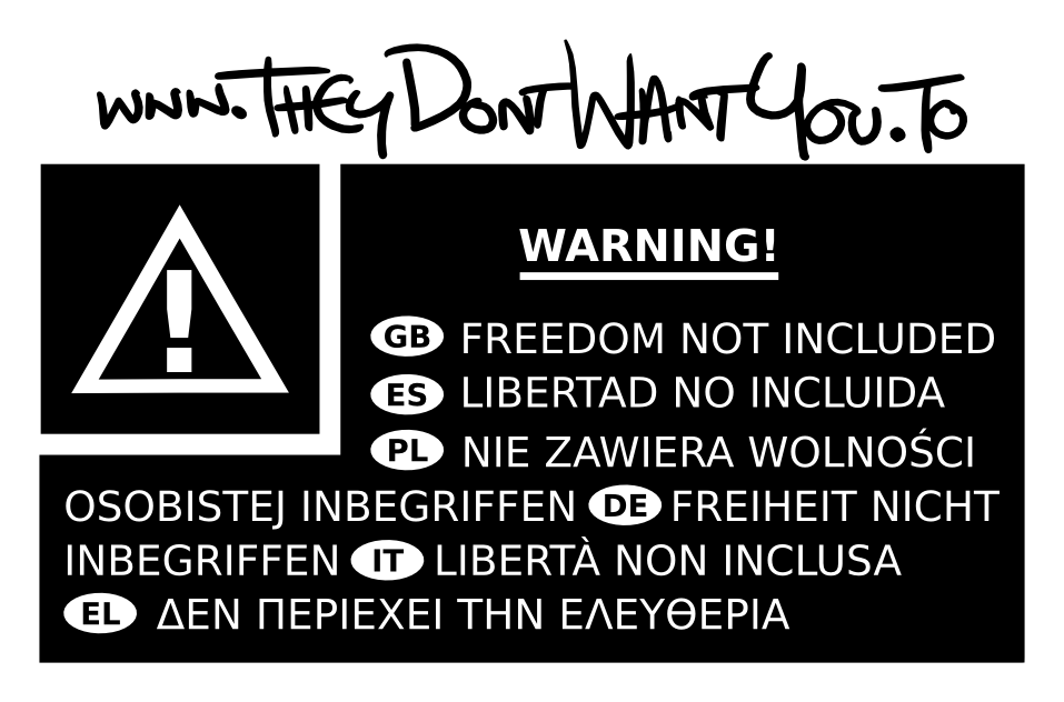
On 29/09/13 15:04, Chris Hayes wrote:
You'll notice that the formerly square tile in which the hazard sign sits is now skewed into rectangle, with longer horizontal sides than it's vertical ones.
Furthermore, both the hazard sign and the 'warning!' text are no longer horizontally centred on their respective surfaces.
Sorry - I should have explained that the versions I attached were for printing, and so included a +3mm border on all sides for the "bleed zone" of the inks. Therefore everything should be squared and centered when the bleeds are removed.
I've now attached the same design but with the bleed zone black background removed.
Look OK to you?
Best,
Sam.