Hi,
I'm glad to throw in my opinion here, but want to stress that I'm not a contributor in the website team. So my opinions are just what they are:
On 16/02/14 21:45, Franz Gratzer wrote:
Hi,
thanks for your feedback, Robert. I'm glad that I am not the only one seeing potential for improvement. I did mock-ups like you suggested (with the font face already used on the web page).
I argued we should use more images, but I didn't want to force anybody to take care of getting pictures for new content all the time. Therefore I didn't include any additional imagery.
@image slider Everybody seems to favor images, and they're part of the design - so don't avoid them. Using them just for typo is a cheap way out and a bad hack. If it turns out to be too much of a challenge you should probably get rid of the slider altogether. coming up with a interesting, unique and consistent way to alter images (colorization, effects.) might pave the way for easier content maintenance. The background has too few contrast to that particular slider image, too imho.
Home page: http://www.veganmania.at/div/web-mockup.png
I wanted to change as little as possible. I mainly tried to clearly separate different blocks with enough space and careful styling. I didn't want to add any new elements.
@typography why do you abandon roboto in the headline? my main problem was the wrong use of font weights: the original mixes light and heavy weights at almost the same sizes in headline and copy text - creating visual confusion. adding a new font does not help here inmho. i suggest just using roboto at font-weight 300 most of the time in this context.
@color I think you changed way too much with introducing a new background and type color. They're not part of the styleguide: https://fsfe.org/contribute/designers/styleguide.en.html and also do not contribute to the "fresh" feeling it establishes. I'd stick to white and bright gray in the background.
I kept the waves from the sub pages (deliberately not those from the home page). Further more I positioned them on the bottom of the content area instead of above the last item.
works better that way indeed.
The footer is complicated. It contains several floating columns with variable width, but fixed height. This way the columns behave like words in a text line and will adapt to every screen width. But I wouldn't put that many links in this complex structure. In my opinion it would work much better if we just showed a link to a complete hierarchical site map.
you're right. the footer seems to actually *be* a sitemap. if this is intentional it should be complete. Otherwise it seems overloaded to me as well. Linking to a proper sitemap sounds like a good idea.
Sub-pages: http://www.veganmania.at/div/web-mockup-sub.png
I strongly suggest getting rid of the multi-column layout on the sub pages. More than one column containing the same content type makes it impossible to conveniently scan through the content of a page if the columns contain more than just single word lists. Therefore it's very frustrating on normal sized monitors. (I guess multi-column layouts are popular because they are a fast/cheap solution if people optimise designs for small screens without enough patience to do the same for workstation displays. But disregarding design/usability flaws on larger screens is not less problematic than ignoring mobile devices.)
Lines with too many characters aren't nice to read. So I actually embrace the three column approach. the first column isn't used much at all and the others are mostly filled with short text units.
Since the FSFE web site has quite a deep structure people can get completely lost without a breadcrumb navigation. Therefore I added it on top of the content area on my sub page layout.
i ahve the feeling that one of the advances of the new design was to hide the deep content structure from unnecessary confusion. the main menu does a great job in that, i don't see much of a need for a breadcrumb for most of the people (espacially because deeper links are placed at the bottom - not the top) but this might be just my dislike for breadcrumbs in general.
Please tell me what you think of my proposals!
I think you raised some valid concerns but think your proposals head in a wrong direction.
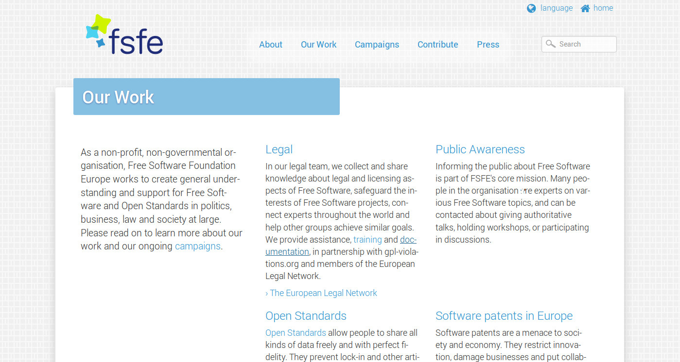
In suggest keeping it to minor corrections like the small css changes i introduced to the "Our Work" page in the attachment
1. added 4x border radius to the corners of the background and headline background shape 2. changed weight and shadow color of headline 3. shortened the "home" & "language" buttons on the top left 4. added (maybe too much) transparent white background glow to the main menu 5. changed copy text weight to 300, too.
treating the front page the same way and adding "better" slider images would be good enough for me. actually i think the site looks way better than fsf already ;)
Robert